LaPorta
Categories
Branding, Visual Identity, Digital Design
Client
LaPorta
Project
Luxury Lifestyle Concierge Brand
Services
Brand Development Logo and Visual Identity Design Bespoke Typography Landing Site Design
Year
2024
LaPorta is a London-based concierge service providing personalised lifestyle management to an international clientele. The ambition was to establish a sophisticated brand for a discreet ‘stealth wealth’ audience, reflecting a service built around trusted relationships, specialist access and close attention to individual needs. Working collaboratively across strategy, audience definition and brand development, my contribution focused on the bespoke typographic logo, wider visual identity and landing site design. Together, these elements established a distinctive and considered brand presence aligned with the personal character of the service.


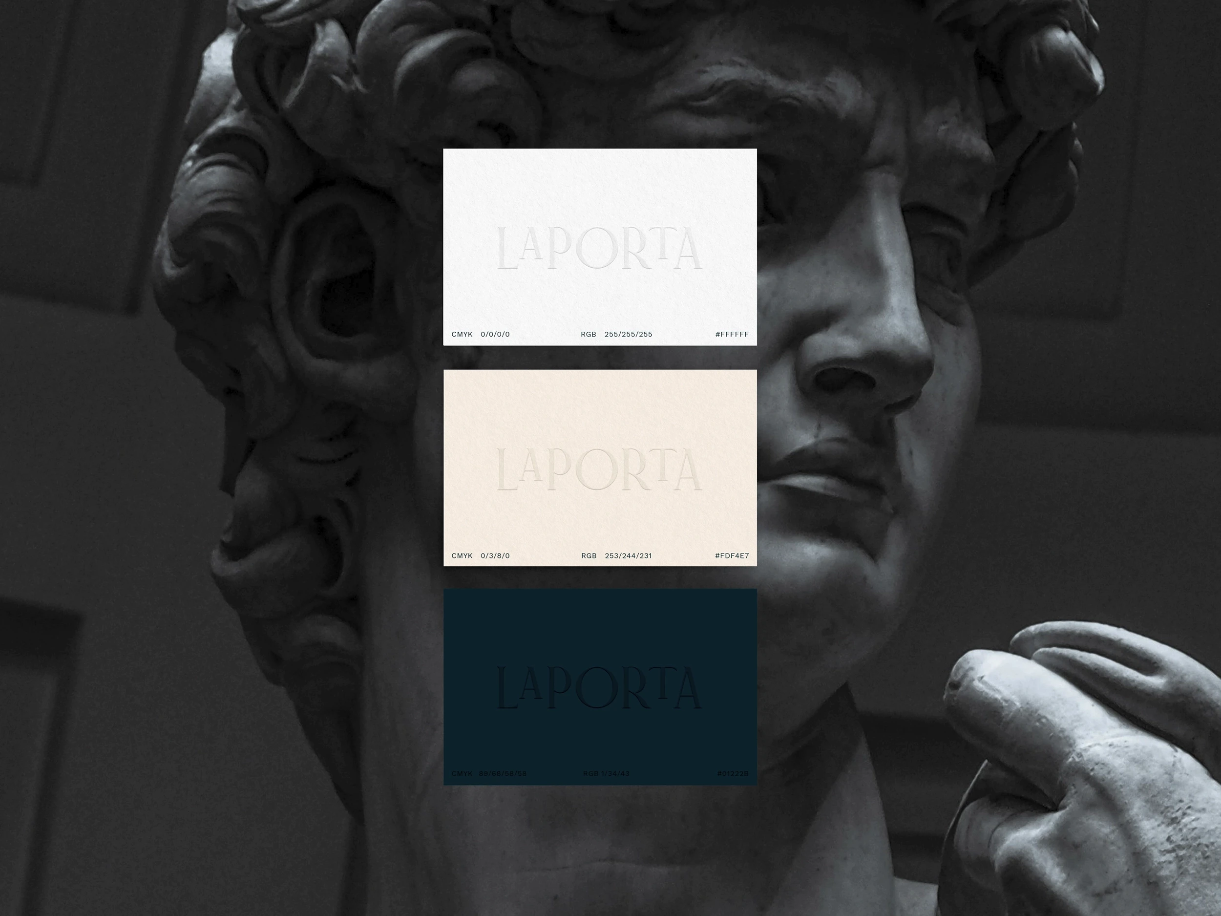
The identity needed to communicate luxury without relying on overt or conventional status cues. Instead, the creative direction centred on restraint, personality and detail, positioning LaPorta as a discreet alternative within the lifestyle-management sector. The visual approach was shaped around the expectations of an international membership while retaining a European character, creating a brand that feels sophisticated and established without becoming formal or impersonal.
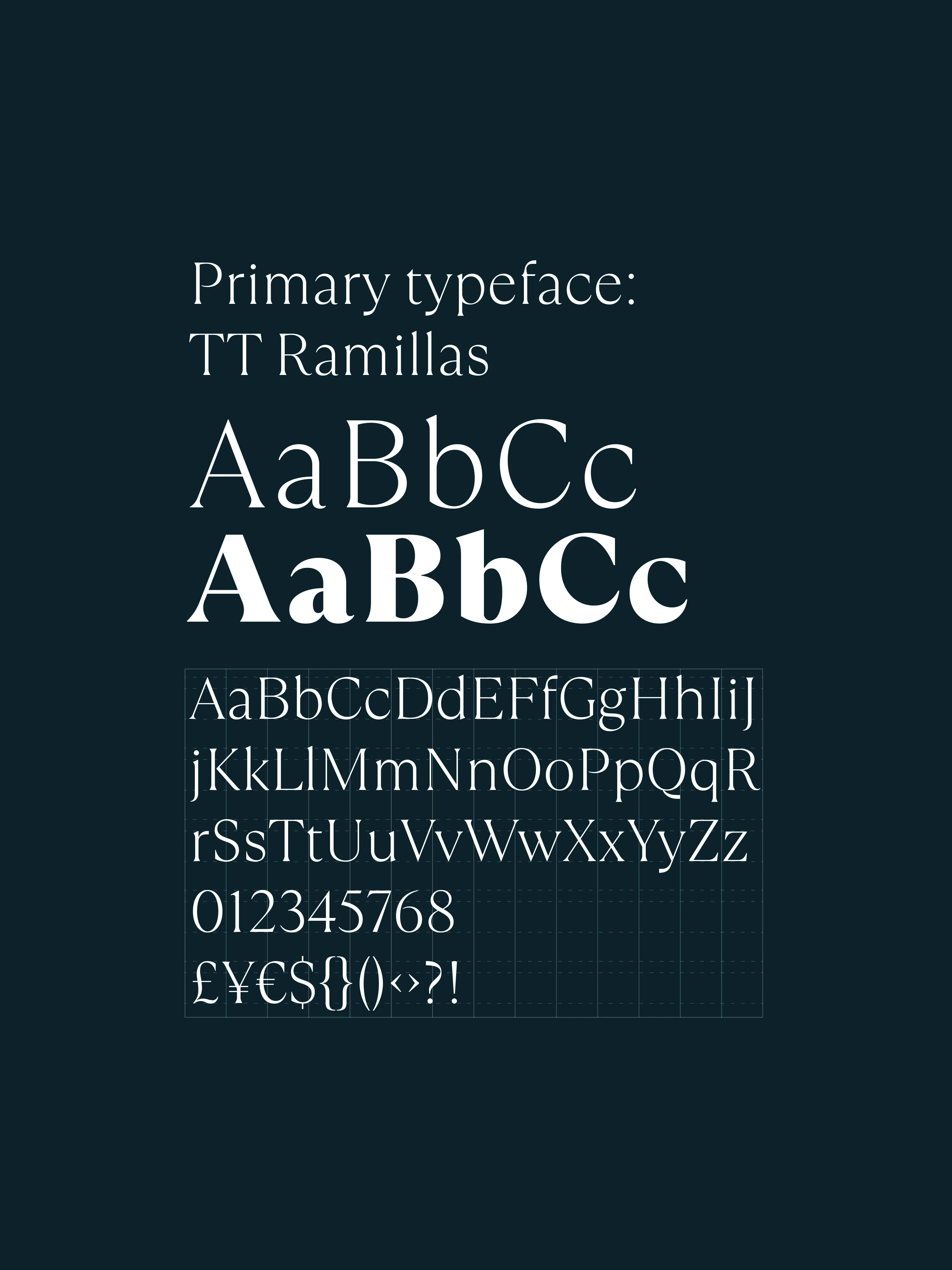
My design work began with a bespoke typographic logo, developed as the defining element of the identity. Rather than pairing a standard typeface with a separate symbol, the mark uses customised letterforms to give LaPorta its own recognisable character. The typography balances refinement with a subtle sense of playfulness, establishing the foundation for a wider visual language that could represent both the discretion of the service and the highly personal experiences offered to its members.
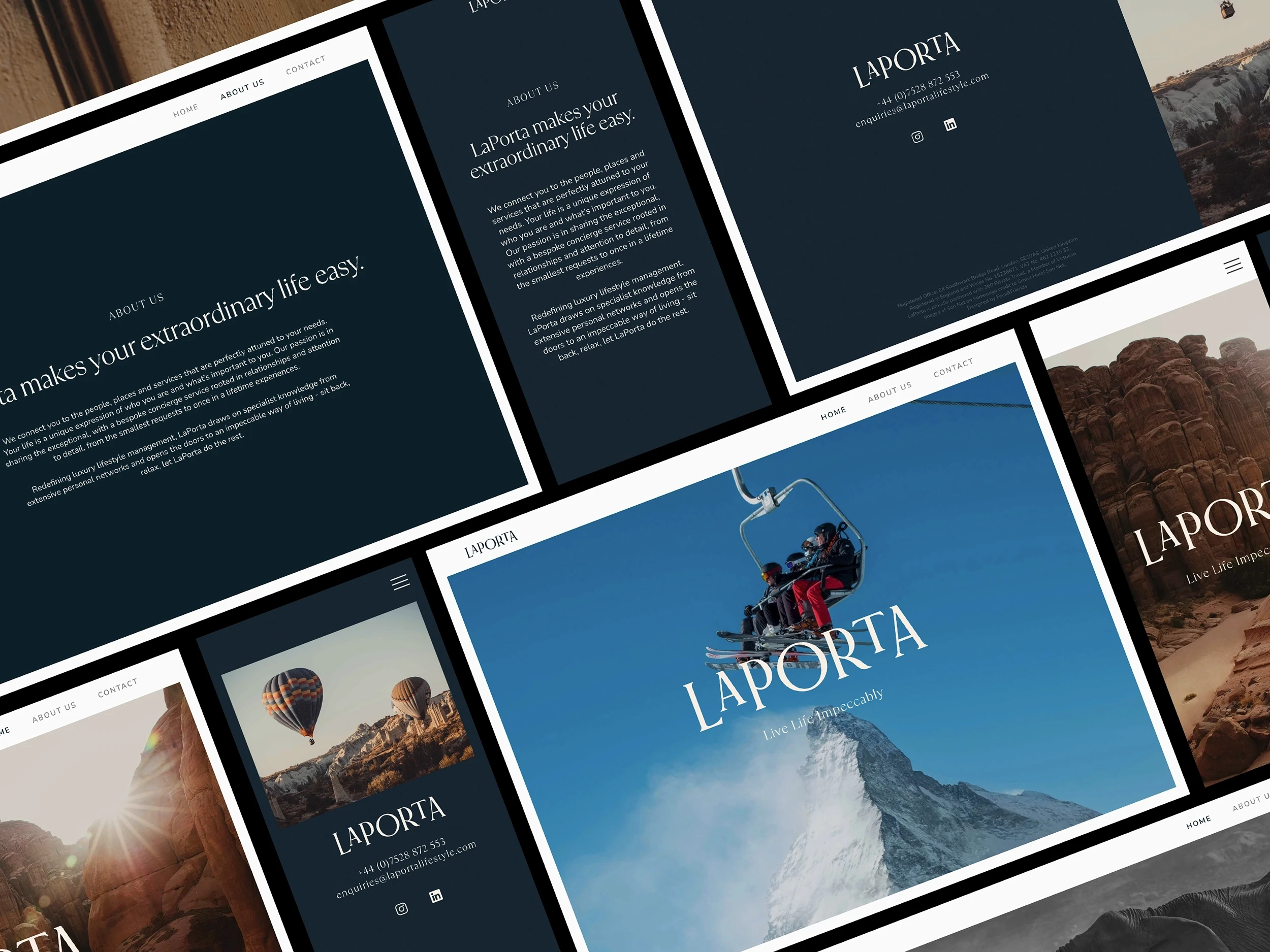
I extended the visual identity into the landing site, translating the brand into a focused digital introduction to LaPorta and its services. The design created a consistent connection between the typographic identity and the brand’s online presence, providing a clear foundation for communicating with prospective members across the United Kingdom, United States and Europe.