Eversmith
Categories
Branding, Digital Experience, Luxury Property
Client
Eversmiths
Project
Prime Residential Brand Repositioning
Services
Brand Identity Bespoke Wordmark Design UX/UI Design Website Design
Year
2025
Eversmiths delivers highly considered residential projects for high-net-worth and ultra-high-net-worth clients across the UK. The project called for more than a visual refresh: it required a fundamental repositioning of how a prime construction company presents itself to an audience accustomed to refinement at every touchpoint. As lead designer, I developed the bespoke wordmark, visual identity and website UX/UI, translating Eversmiths’ precision, craftsmanship and attention to detail into a distinctive brand experience. The result moves away from conventional construction-sector codes, positioning Eversmiths alongside the architects, interior designers and luxury brands familiar to its clientele.


The identity deliberately challenges the heavy, industrial language commonly associated with construction. A palette of Scarlett and Ivory introduces warmth, heritage and sophistication, while the bespoke serif wordmark gives the brand a sense of restraint and permanence. I developed the wider visual system around these elements, ensuring every application reflected the same precision, material sensitivity and close attention to detail that define Eversmiths’ private residential projects.
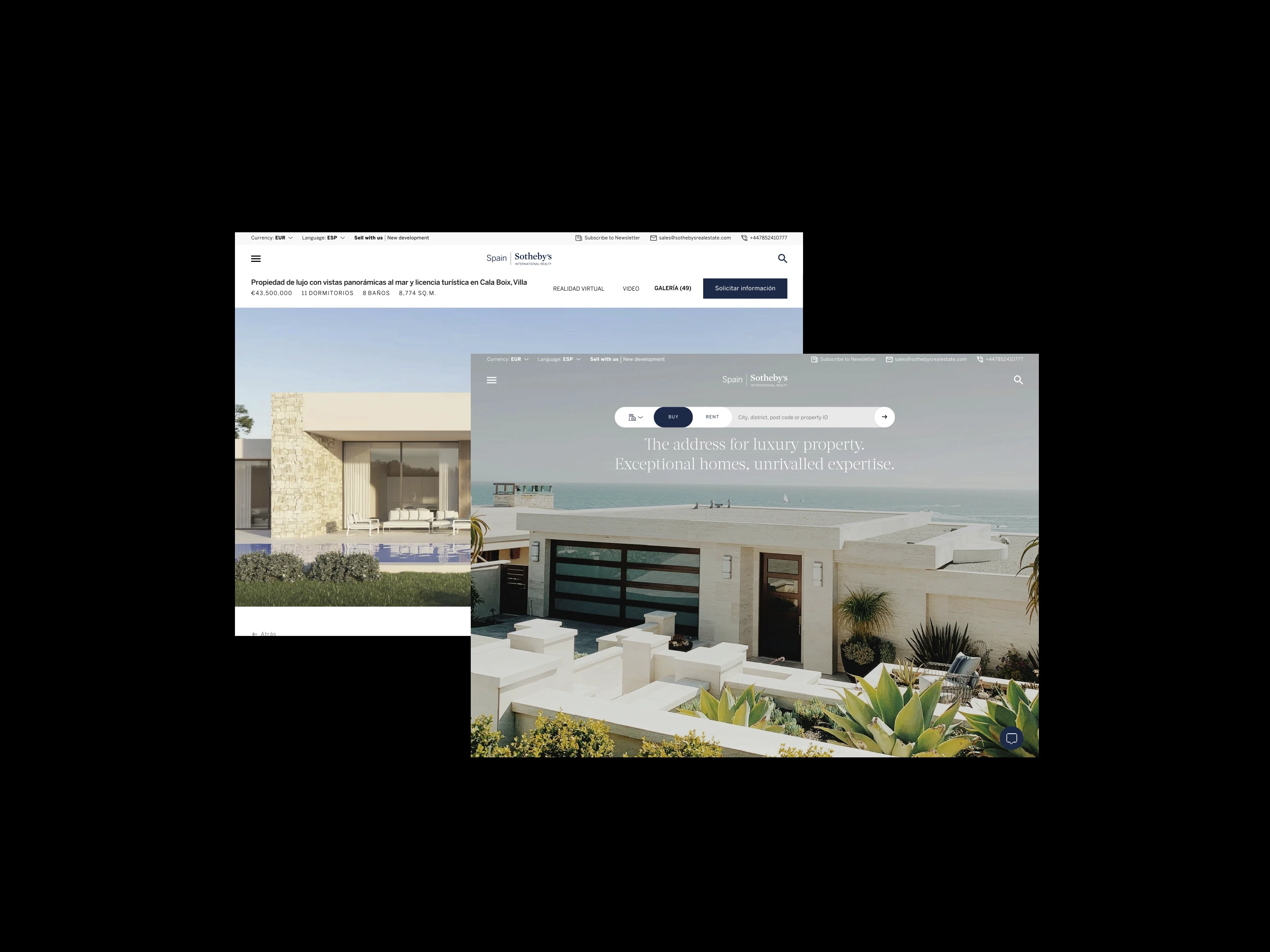
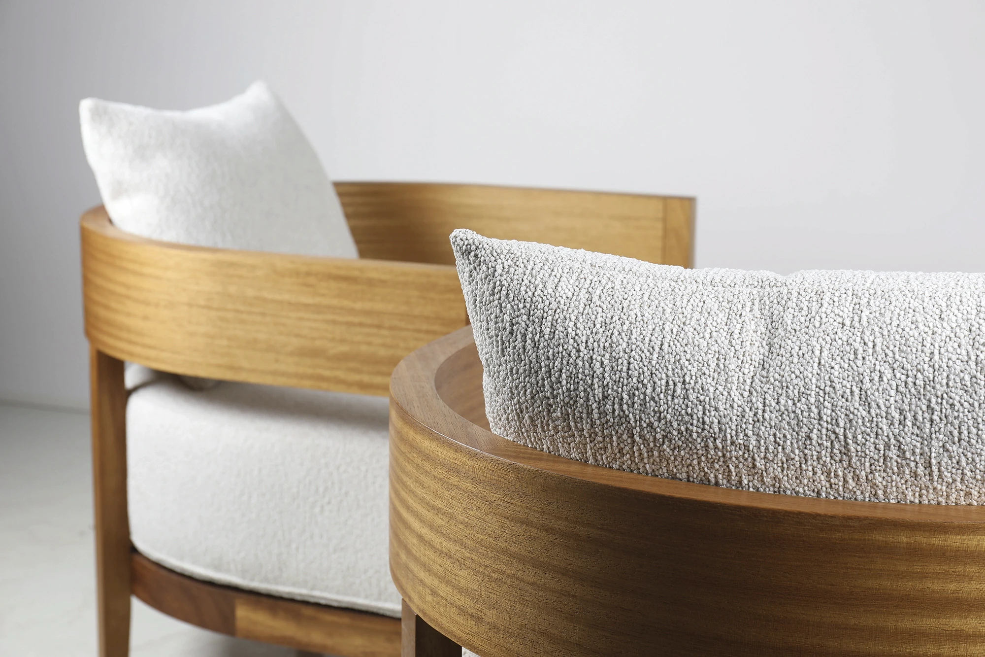
The website translates this positioning into an editorial digital experience centred on atmosphere, materiality and craftsmanship. I led the UX and interface design, structuring the experience around Eversmiths’ philosophy, approach and portfolio rather than conventional capability-led construction messaging. Considered hierarchy, typography, and image-led layouts allow details of joinery, stonework, natural light and interior composition to communicate the quality of the work with clarity and restraint.
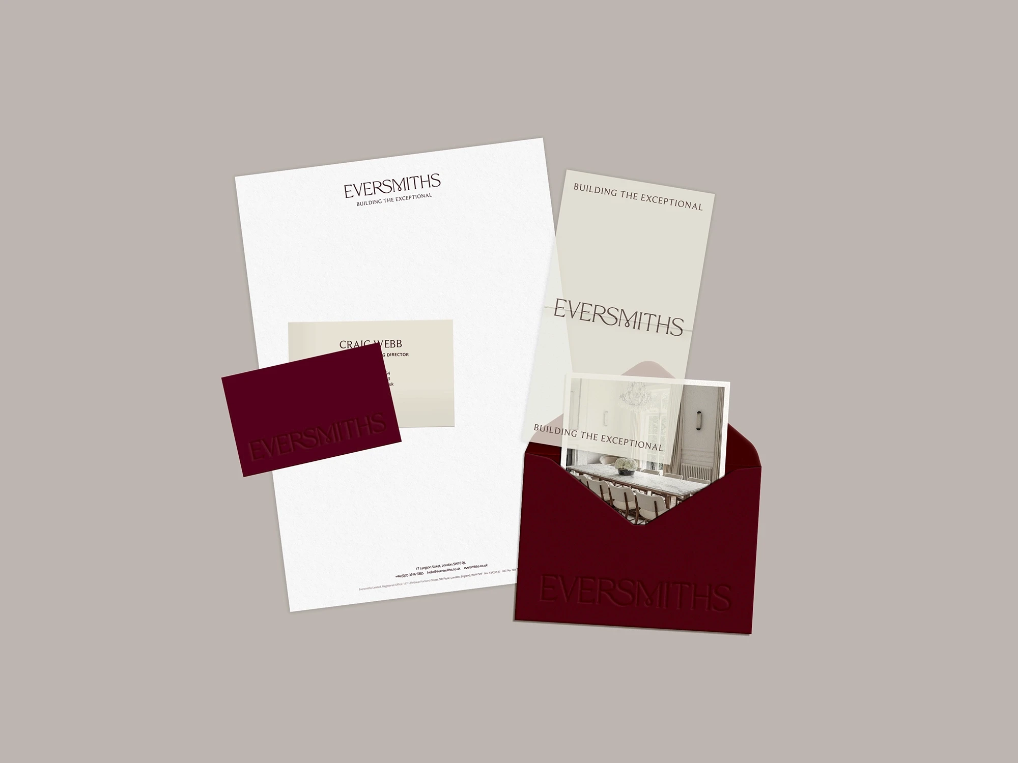
The verbal direction complements the visual system through language centred on British craftsmanship, personal connection and uncompromising quality. A warm, direct and assured tone moves away from impersonal industry terminology, presenting Eversmiths as a close project partner rather than a conventional contractor. Across the identity and website, this creates a consistent brand experience aligned with the highly personal nature of designing and constructing an exceptional home.
Together, the bespoke wordmark, visual identity and digital experience establish a more relevant position for Eversmiths within the prime residential market. By replacing familiar construction archetypes with a quieter and more crafted expression, the brand communicates quality through precision rather than scale or force, reflecting both the calibre of the company’s work and the expectations of its clientele.